
17/12/2012

10/12/2012
Technologiesprung Infographic: Zwei Drittel deutscher KMUs wollen Videokonferenzen nutzen
Technologiesprung: Zwei Drittel deutscher KMUs wollen Videokonferenzen nutzen


29/11/2012
Le couteau suisse de la présentation professionnelle - Brother Infographic
"The swiss army knife of professional presentation!"
 See La Visioconférence en France infographic.
With the launch of OmniJoin, Brother offers HD video conferencing service to French SMEs. This online solution allows virtual meetings fast, reliable and secure, with HD video and audio quality broadband.
OmniJoin, an appropriate response to the needs of virtual meetings of French SMEs Recent research from IDC shows a growth in demand for video conferencing by SMEs. In France, 17.3% of them are already using this solution and 55.6% believe the use within five years. Today OmniJoin allows smaller firms or teams to save time and money by organizing virtual conferences where HD video and audio to broadband, as well as a full suite of collaboration tools offer a seamless experience as close as possible to a face to face trial For Free http://visioconference.brother.fr/
OmniJoin is based on technology Nefsis U.S. developers, pioneers in cloud videoconferencing and over the last ten years, have developed software that makes the extraordinary technology affordable for SMEs ambitious, "said Richard Thomas , Product Planning Manager at Brother International Europe Ltd.
Since Nefsis Brother bought last year, we worked with a team of developers in San Diego and Nagoya to improve the user experience, document sharing and interoperability. The result is a fantastic product at an affordable price for SMEs, which gives them access to a videoconferencing solution quality HD, whatever their size and resources, "he says.
• The HD video conferencing from anywhere
OmniJoin is a cloud service that offers true HD video quality, a broad-band sound and adequate security companies. It runs on regular fixed or portable computers with an Internet connection, regardless of location.
• Video and sound clarity incomparable
OmniJoin offers a sound and HD video and high-quality dynamically selects the optimal server for each conference, so that the lowest latency possible.
• Reliable, safe and compatible with computer facilities in place
OmniJoin was developed to adapt and work with corporate environments, so that the success rate of connections is optimal, even in locked-down environments.
• Scalable, interoperable hardware independent
Unlike standard integrated solutions, OmniJoin be used on PC and is designed to work with a standard equipment.
• Satisfied users
Brother has focused on the experience of the user OmniJoin to ensure that even technophobes can integrate it into their daily work without worrying. OmniJoin automatically creates a permanent conference room for each user This allows you to explore the features without having to organize conference. In addition, the unique address of the conference room can be added to customized signature to e-mail and be easily shared.
Additional features facilitate collaboration on a daily basis, including live sharing applications, documents , files and offices, but also powerful annotation tools and an integrated editor pdf documents. Conferences can be recorded in MPEG-4 format, downloaded, saved and modified.
And then?
Macintosh version and compatibility phonebridge * will be available in the coming months and mobile versions and tablets will be the first quarter of 2013. The next year, an extension of document handling capabilities will be integrated into the software, "says Richard Thomas.
27/11/2012

26/11/2012

09/11/2012

30/10/2012
Baby Infographic - A Baby's First Year - What an Adventure!

Epik CV - Create the Ultimate CV


21/08/2012

10/08/2012

19/07/2012

30/06/2012
Interactive Infographic Design - Raw Chocolate History
A new interactive infographic from the guys at WOND and raw chocolate company the Chocolution.

Click to see the fully interactive raw chocolate history infographic or to learn more about or buy raw chocolate.
It's a beautiful graphic but it's best to see the one on theChocolution.com website as it's interactive and you just have to hover the mouse over each picture on the circular timeline to get that little nugget of history, cool eh! I like the way the cocoa pods measure cocoa purity and cocoa processing level depending on their colour. There's a lot of information here and to understand, they seemed to have really wanted to give a complete picture of our 4000+ year history with the chocolaty temptress. Another cool design feature is that the timeline is circular as if it's going back on itself suggesting how our chocolate history is reverting back to ancient values, cool huh? Enjoy.
10/06/2012
Burger Menu Infographic
MMM a burger menu infographic....Here's a bit of good, honest information design from the good honest fellows at Honest Burgers in Brixton (London, UK) have a deliciously designed menu, simple easy to read and understand and a joy to peruse with a little extra flavour than your average menu list layout.
There's something just a bit more satisfying about an infographic when the result is a tasty burger! Just look the fine grilled example! Delicous menu design and a truly delicious burger, go to Brixton market now and enjoy the rosemary chips too!!


There's something just a bit more satisfying about an infographic when the result is a tasty burger! Just look the fine grilled example! Delicous menu design and a truly delicious burger, go to Brixton market now and enjoy the rosemary chips too!!


24/05/2012
Infographic Design - Evolution of Motorcycle Safety
So here we have a motorcycle infographic visualizing the evolution of safety. The peak of motorcycle deaths in the UK was in the 60s, could've had something to do with the hippy movement or the fact that learner riders weren't restricted to the size of engine so actually could ride anything from a vespa to a harley!
The infographic design is ok and if you ride a motorbike I'm sure you'll find it fairly interesting but my favourite thing about the infographic is that it advertises an e-pitition which seeks to ensure biker safety by making biker related questions in driving tests compulsory. Personally I think this is hugely important for a better education of driver.
Go to www.bikerpetition.co.uk to sign this petition and help improve motocycle safety in the UK.

Infographic by Bennetts
16/05/2012
Typographic Infographic for Learning Languages
Very nice clean and clear piece of typography and infographic design here.
This is an educational and typographic infographic available in four colour variations including one easy to print version. You can see all colour versions by visiting the link at the bottom of this post. Infographic designers WOND are responsible for this and I think they are definitely people to watch out for. Great designs that are clear and have a great sense of visual hiearchy and layout prowess.
This infographic was designed to make it easy to learn the different parts of the body in Spanish. It was designed by WOND.co.uk and may end up as a series of language learning infographics. The human body is constructed from typography and so every part is clear to understand. I'm already saying brazo for arm and cabeza for head!
 Infographic design by WOND
Infographic Police RATING: 8/10
Positives: Clear, clean, easy to read, cool use of typography
Against: Would like to see a whole series of these infographics helping people learn all sorts of aspects of the Spanish language.
Infographic design by WONDInfographic Police RATING: 8/10
Positives: Clear, clean, easy to read, cool use of typography
Against: Would like to see a whole series of these infographics helping people learn all sorts of aspects of the Spanish language.
03/05/2012
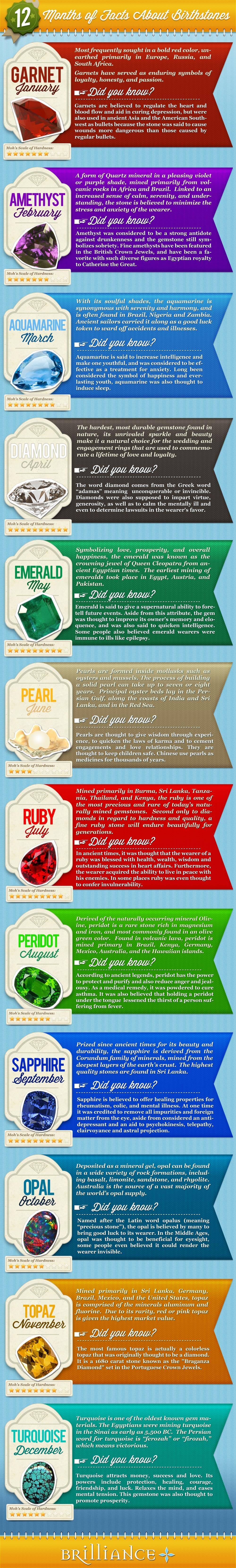
Birthstones Infographic - What Birthstone Are You?
12 Months Of Facts About Birthstones in an infographic making it clear and easy to discover and learn more about your birthstone...interesting ey. . . .After doing some stoney being born research (well a wikipedia search) I found out that a person's birthstone differs depending on culture, religion, time zone, you know, the usual so this infographic is lacking some vital juice if you ask me...
It's super long and slim but enlarges to a normal size and not the most groundbreaking design but at least it is clear and easy to understand and it didn't take anytime to find my birthstone and learn more so fair play.
It could have had a more exciting layout, I always like a circle or clock dial style for these so it's easy to see all the birthstones at once, PLUS they could've included the different birthstones dependent on culture and ting this way, BUT it makes adding the copy really tricky...so understandable why they didn't bother.
I'm thinking clock dial comparing stones, months and cultures and then a grid of meanings like above but maybe 3 columns instead of 1 and 4 rows all sitting beneath the clock dial, calendar circlular thang...mm
Infographic Police Rating: 5/10
Pluses: Clear, Legible, Straight to the point.
Minuses: Design not developed and missing that content richness that makes us go WOW!
29/03/2012
Name and Infographic Shame

So I'd just like to take this opportunity to relish in a social media agency who are making (probably quite good) money and delivering poor, lame, uninspiring infographics.
Their style is to basically give you a brochure of information that has undergone a force feeding of imagery and bold fonts.
"Right what we'll do is write down the info client sent us and then...what's it about again...errr....oh yeah cyber security, ok so what looks like cyber security....errrr.....pac man? yeah pac man because he's trying to eat little circles and run away from jelly babies...errrr really?
Yeah, really, so let's make the fonts really bold yeah, fat! And let's shove pac man there there and there in the gaps. Perfect. Errr... what else??? mmmm, f**$ it it's fine, client will like it, on to next one robin!!
Guys if you ever come across this post, ignore my rant, but please think about hierarchy of visual design, not everything can SHOUT off the page, think about dynamics please.
If you want to see their sh** excuse for data viz, it's here: nowsourcing.com/category/portfolio/
mierda
21/03/2012
Poor American Healthcare Infographic
 I do, genuinely feel sorry for the Americans. Their health system is a bad joke, something so responsible for human life and it's run for profit. Shit. Well the UK maybe getting close to it these days. I heard that American healthcare costs double the UK's and is worse than a lot of poorer countries. But we cannot doubt the thirst in American culture to make a buck and it is as simple as that. They lurve the green....
To be honest I haven't spent much time looking at this because it is a bit full on, design wise, all the elements are SCREAMING off the page it's like looking at the Tabloid front page from hell. Anyway apart from the low Infographic Police rating of 2 I will give it I won't waste anymore of your time. or mine.
20/03/2012
Leadership Qualities Infographic
I like the premise of this and it sits well with the client paying for the design. Someone has been able to match a nicely relevant topic that, to me, as a natural leader of course is a little like music. This clear, functional infographic has inspired me to copy the leadership qualities in a more fun and ridiculous manner. Marks for clarity, relevancy and consistency. Marks off because it's always nice to have some graph data so there can be more squiggly lines.
So Visual Chief leadership qualities are as follows:
#1 Bottle. The propensity to do whatever one wants without giving two hoots to anyone else's opinion.
#2 Charm. Ah the je ne sais quois of Father Christmas.
#3 Balls. Those nuts Ramses himself can't crack.
#4 Believable. Tell them "walk off the cliff and you will fly" and they'll keep walking one after the other falling to their . . .
#5 Ear Chew Master. To be able to wear someone so drastically with words that they melt into accepting anything you say just to get home and have a cuppa.
sorry i would carry on but it's a little late and I'm bored, enjoy the real leadership qualities below;

Infographic Police Rating: 8/10. Clear and direct, doesn't feel like it's pretending to be something it's not.
So Visual Chief leadership qualities are as follows:
#1 Bottle. The propensity to do whatever one wants without giving two hoots to anyone else's opinion.
#2 Charm. Ah the je ne sais quois of Father Christmas.
#3 Balls. Those nuts Ramses himself can't crack.
#4 Believable. Tell them "walk off the cliff and you will fly" and they'll keep walking one after the other falling to their . . .
#5 Ear Chew Master. To be able to wear someone so drastically with words that they melt into accepting anything you say just to get home and have a cuppa.
sorry i would carry on but it's a little late and I'm bored, enjoy the real leadership qualities below;
Infographic Police Rating: 8/10. Clear and direct, doesn't feel like it's pretending to be something it's not.
Pain, No Gain: Skate and Snow Safety Infographic
Well well well, this is quite an exceptionally badly conceived infographic. Is the visualisation world perhaps getting saturated with really uninformative guff like this piece? mmmmaybe. It's pretty basic and not too insightful. It would've been nice if it wasn't designed using microsoft publisher but hey c'est la vie friends.
Snowboarding is pretty dangerous so why not do an information graphic showing all the awesomely risky tricks a skater does or the biggest airs of all time, come on think, no one really wants to look at this.
Infographic Police Rating, 2/10. Because they remembered the title and "Pain, No Gain" really sums up the pleasure of seeing this information.
Subscribe to:
Comments (Atom)