24/05/2012

Infographic Design - Evolution of Motorcycle Safety

So here we have a motorcycle infographic visualizing the evolution of safety. The peak of motorcycle deaths in the UK was in the 60s, could've had something to do with the hippy movement or the fact that learner riders weren't restricted to the size of engine so actually could ride anything from a vespa to a harley! The infographic design is ok and if you ride a motorbike I'm sure you'll find it fairly interesting but my favourite thing about the infographic is that it advertises an e-pitition which seeks to ensure biker safety by making biker related questions in driving tests compulsory. Personally I think this is hugely important for a better education of driver. Go to www.bikerpetition.co.uk to sign this petition and help improve motocycle safety in the UK. The Evolution of Motorcycle Safety

Infographic by Bennetts

16/05/2012

Typographic Infographic for Learning Languages

Very nice clean and clear piece of typography and infographic design here. This is an educational and typographic infographic available in four colour variations including one easy to print version. You can see all colour versions by visiting the link at the bottom of this post. Infographic designers WOND are responsible for this and I think they are definitely people to watch out for. Great designs that are clear and have a great sense of visual hiearchy and layout prowess. This infographic was designed to make it easy to learn the different parts of the body in Spanish. It was designed by WOND.co.uk and may end up as a series of language learning infographics. The human body is constructed from typography and so every part is clear to understand. I'm already saying brazo for arm and cabeza for head! Infographic-designers-Wond-designed-Partes-Del-Cuerpo-Parts-of-the-body-Spanish-Espanol-colourInfographic design by WOND

Infographic Police RATING: 8/10
Positives: Clear, clean, easy to read, cool use of typography
Against: Would like to see a whole series of these infographics helping people learn all sorts of aspects of the Spanish language.

03/05/2012

Birthstones Infographic - What Birthstone Are You?


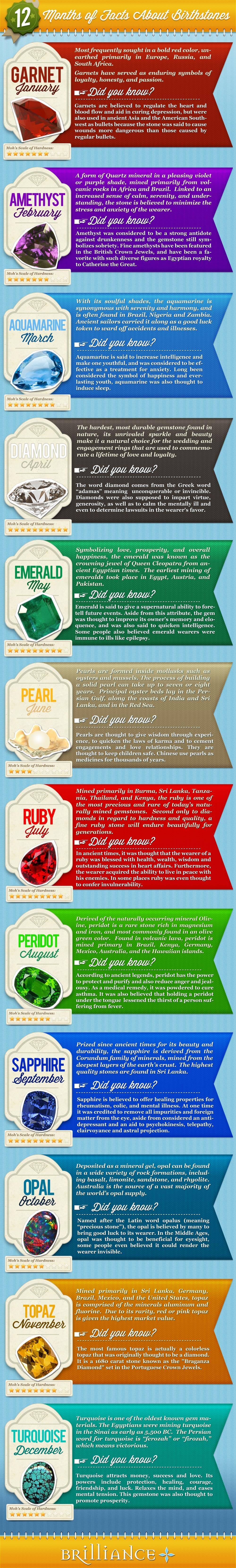
12 Months Of Facts About Birthstones in an infographic making it clear and easy to discover and learn more about your birthstone...interesting ey. . . .After doing some stoney being born research (well a wikipedia search) I found out that a person's birthstone differs depending on culture, religion, time zone, you know, the usual so this infographic is lacking some vital juice if you ask me...

It's super long and slim but enlarges to a normal size and not the most groundbreaking design but at least it is clear and easy to understand and it didn't take anytime to find my birthstone and learn more so fair play.


It could have had a more exciting layout, I always like a circle or clock dial style for these so it's easy to see all the birthstones at once, PLUS they could've included the different birthstones dependent on culture and ting this way, BUT it makes adding the copy really tricky...so understandable why they didn't bother.

I'm thinking clock dial comparing stones, months and cultures and then a grid of meanings like above but maybe 3 columns instead of 1 and 4 rows all sitting beneath the clock dial, calendar circlular thang...mm

Infographic Police Rating: 5/10
Pluses: Clear, Legible, Straight to the point.
Minuses: Design not developed and missing that content richness that makes us go WOW!