29/03/2012
Name and Infographic Shame
So I'd just like to take this opportunity to relish in a social media agency who are making (probably quite good) money and delivering poor, lame, uninspiring infographics.
Their style is to basically give you a brochure of information that has undergone a force feeding of imagery and bold fonts.
"Right what we'll do is write down the info client sent us and then...what's it about again...errr....oh yeah cyber security, ok so what looks like cyber security....errrr.....pac man? yeah pac man because he's trying to eat little circles and run away from jelly babies...errrr really?
Yeah, really, so let's make the fonts really bold yeah, fat! And let's shove pac man there there and there in the gaps. Perfect. Errr... what else??? mmmm, f**$ it it's fine, client will like it, on to next one robin!!
Guys if you ever come across this post, ignore my rant, but please think about hierarchy of visual design, not everything can SHOUT off the page, think about dynamics please.
If you want to see their sh** excuse for data viz, it's here: nowsourcing.com/category/portfolio/
mierda
21/03/2012
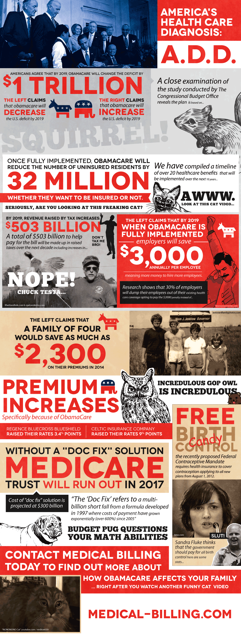
Poor American Healthcare Infographic
 I do, genuinely feel sorry for the Americans. Their health system is a bad joke, something so responsible for human life and it's run for profit. Shit. Well the UK maybe getting close to it these days. I heard that American healthcare costs double the UK's and is worse than a lot of poorer countries. But we cannot doubt the thirst in American culture to make a buck and it is as simple as that. They lurve the green....
To be honest I haven't spent much time looking at this because it is a bit full on, design wise, all the elements are SCREAMING off the page it's like looking at the Tabloid front page from hell. Anyway apart from the low Infographic Police rating of 2 I will give it I won't waste anymore of your time. or mine.
20/03/2012
Leadership Qualities Infographic
I like the premise of this and it sits well with the client paying for the design. Someone has been able to match a nicely relevant topic that, to me, as a natural leader of course is a little like music. This clear, functional infographic has inspired me to copy the leadership qualities in a more fun and ridiculous manner. Marks for clarity, relevancy and consistency. Marks off because it's always nice to have some graph data so there can be more squiggly lines.
So Visual Chief leadership qualities are as follows:
#1 Bottle. The propensity to do whatever one wants without giving two hoots to anyone else's opinion.
#2 Charm. Ah the je ne sais quois of Father Christmas.
#3 Balls. Those nuts Ramses himself can't crack.
#4 Believable. Tell them "walk off the cliff and you will fly" and they'll keep walking one after the other falling to their . . .
#5 Ear Chew Master. To be able to wear someone so drastically with words that they melt into accepting anything you say just to get home and have a cuppa.
sorry i would carry on but it's a little late and I'm bored, enjoy the real leadership qualities below;
Infographic Police Rating: 8/10. Clear and direct, doesn't feel like it's pretending to be something it's not.
Pain, No Gain: Skate and Snow Safety Infographic
Well well well, this is quite an exceptionally badly conceived infographic. Is the visualisation world perhaps getting saturated with really uninformative guff like this piece? mmmmaybe. It's pretty basic and not too insightful. It would've been nice if it wasn't designed using microsoft publisher but hey c'est la vie friends.
Snowboarding is pretty dangerous so why not do an information graphic showing all the awesomely risky tricks a skater does or the biggest airs of all time, come on think, no one really wants to look at this.
Infographic Police Rating, 2/10. Because they remembered the title and "Pain, No Gain" really sums up the pleasure of seeing this information.
Subscribe to:
Comments (Atom)


